Browse documentation
Tabs
Switch between related panels without leaving the current view.
Import
Load the optional component layer before using the examples below.
Ruby
require "zaniah/ui"Basic tabs
Each item pairs a label with its panel content. Supply selected: when the application owns selection state.
Rendered example
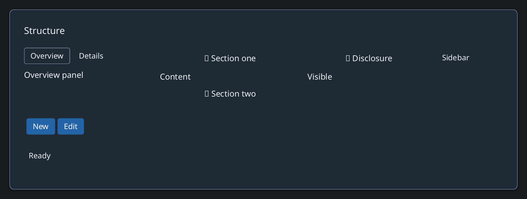
Ruby
Zaniah::UI::Tabs.new([
  ["Overview", Zaniah::UI::Label.new("Summary")],
  ["Details", Zaniah::UI::Label.new("More details")]
])
Selection
on_change reports the selected item. Arrow keys, Home, and End move focus.
Ruby
tabs = Zaniah::UI::Tabs.new(items, selected: 0)
tabs.on_change { |index| puts index }
API summary
Constructor options and behaviors are drawn from the component reference.
| Component | Constructor and methods | Variants or behavior |
|---|---|---|
Tabs | (items, selected:); on_change | arrows/Home/End |
Accessibility
Tabs expose tab and tabpanel roles. Use a short, distinct label for every tab.
| Component | Semantic role |
|---|---|
Tabs | tab/tabpanel |