Browse documentation
Tables and data grids
Display many rows with virtualization, sorting, selection, and optional editing.
Import
Load the optional component layer before using the examples below.
Ruby
require "zaniah/ui"Basic table
Columns use stable keys and optional labels, widths, sortability, editability, and rendering hooks.
Rendered example
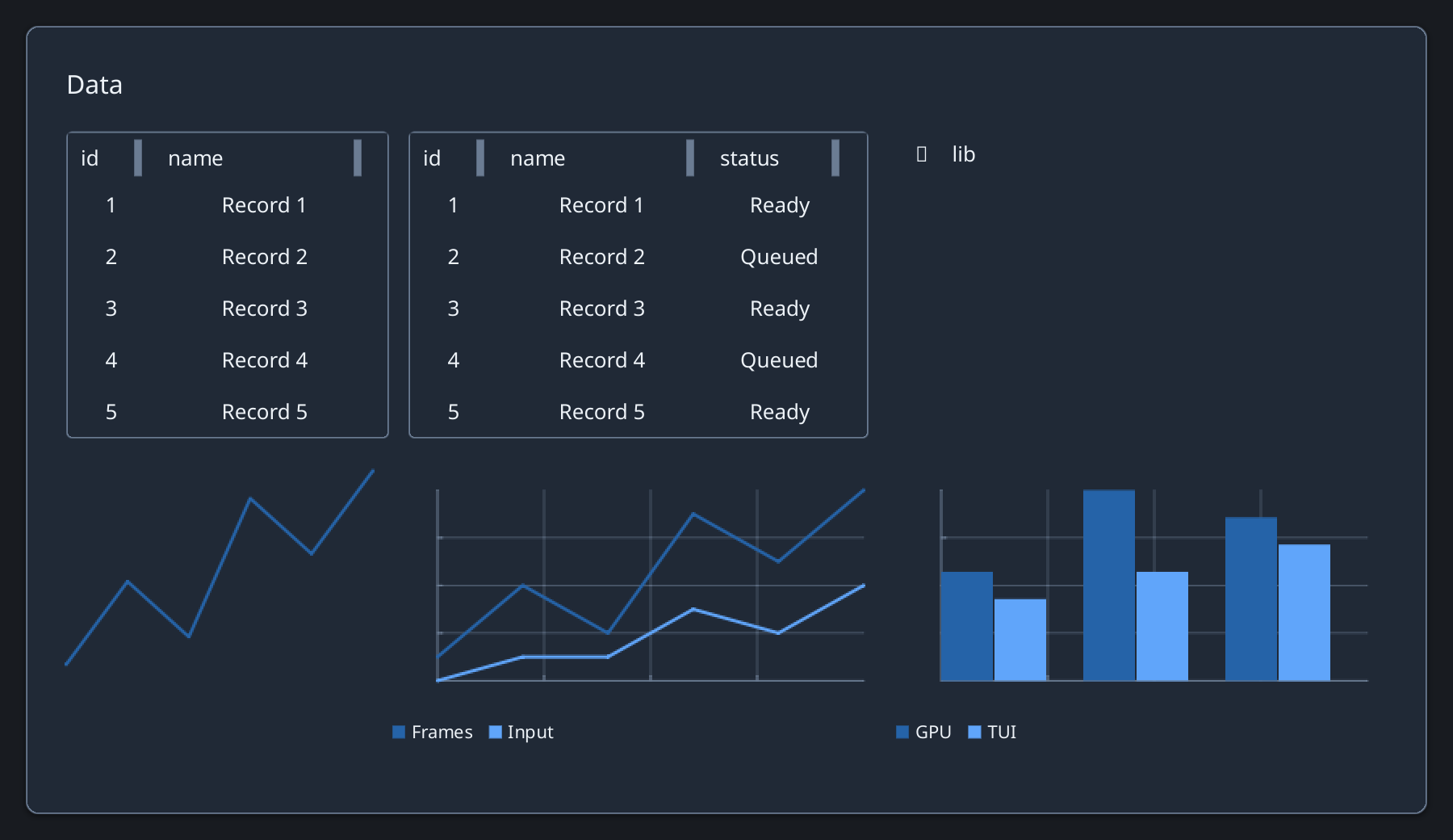
Ruby
rows = [{id: 1, name: "Ada"}, {id: 2, name: "Lin"}]
columns = [{key: :id, width: 54}, {key: :name, width: 140}]
Zaniah::UI::Table.new(rows, columns: columns,
  height: 190, row_key: ->(row) { row[:id] })
Editable grid
DataGrid shares the table model and adds editable cells. Use on_edit to own changes.
Ruby
Zaniah::UI::DataGrid.new(rows,
  columns: [{key: :name, editable: true}],
  height: 190, row_key: ->(row) { row[:id] })
API summary
Constructor options and behaviors are drawn from the component reference.
| Component | Constructor and methods | Variants or behavior |
|---|---|---|
Table, DataGrid | (rows, columns:, height:, selection:, row_key:); on_sort, on_select, on_edit, on_copy, on_paste | virtual rows, sorting, resizing, editing, typed clipboard hooks |
Accessibility
Rows and cells expose table semantics. Keyboard selection, sortable headers, and resize handles have distinct focus targets.
| Component | Semantic role |
|---|---|
Table, DataGrid | table/row/cell |