Browse documentation
Charts
Show trends, categories, proportions, and relationships from simple Ruby data.
Import
Load the optional component layer before using the examples below.
Ruby
require "zaniah/ui"Trends
Use a sparkline for a compact trend. Line, area, and bar charts share axes, ticks, legends, and tooltips.
Rendered example
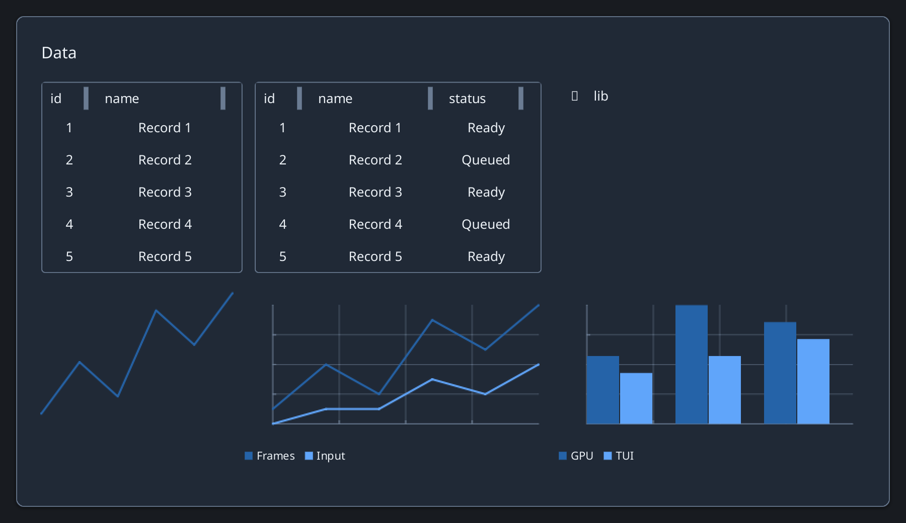
Ruby
Zaniah::UI::Sparkline.new([2, 5, 3, 8, 6, 9],
  width: 190, height: 120, label: "Frames")
Zaniah::UI::LineChart.new({Frames: [2, 5, 3, 8]},
  width: 300, height: 150, label: "Frames")
Zaniah::UI::BarChart.new({GPU: [4, 7, 6]},
  width: 300, height: 150, label: "GPU")
Parts and relationships
Use pie or donut charts for parts of a whole and scatter charts for point relationships. Provide a meaningful label for the chart.
API summary
Constructor options and behaviors are drawn from the component reference.
| Component | Constructor and methods | Variants or behavior |
|---|---|---|
Sparkline | (values, width:, height:, color:, label:) | line + tooltip |
LineChart, BarChart, StackedBarChart, AreaChart | (series, width:, height:, colors:, label:); AreaChart(stacked:) | shared axes, ticks, grid lines, color-keyed legend, tooltip |
PieChart, DonutChart | (data, width:, height:, colors:, label:) | slices, shared color-keyed legend, tooltip |
ScatterChart | (series, width:, height:, colors:, label:) | shared axes, ticks, grid lines, color-keyed legend, nearest-point tooltip |
Accessibility
Charts expose an image role. Provide a descriptive label and an adjacent data summary for important values.
| Component | Semantic role |
|---|---|
Sparkline | image |
LineChart, BarChart, StackedBarChart, AreaChart | image |
PieChart, DonutChart | image |
ScatterChart | image |