Browse documentation
Date, time, and color
Choose dates, ranges, times, and colors using keyboard-friendly controls.
Import
Load the optional component layer before using the examples below.
Ruby
require "zaniah/ui"Date and time pickers
Dates use ISO 8601 strings or Ruby Date values; times use 24-hour notation.
Rendered example
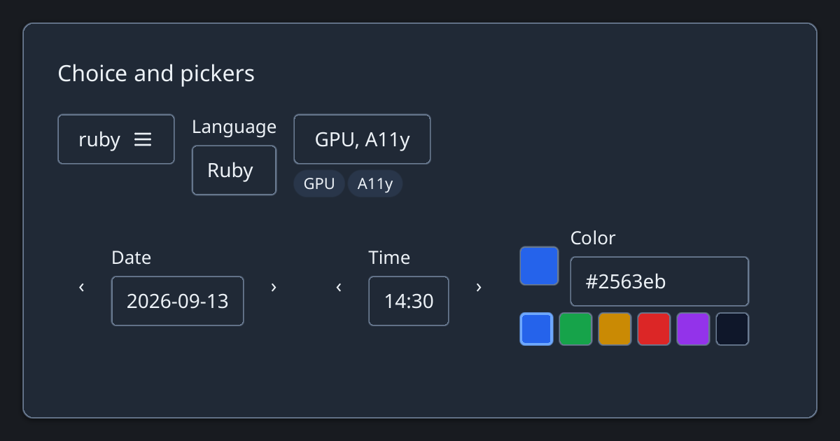
Ruby
Zaniah::UI::DatePicker.new("2026-09-25", label: "Due date")
Zaniah::UI::TimePicker.new("14:30", label: "Start")
Zaniah::UI::ColorPicker.new("#2563eb", label: "Accent")
Calendar and range
Calendar supports week_start: 0..6. DateRangePicker returns a two-element value; the end can be nil until selected.
Rendered example
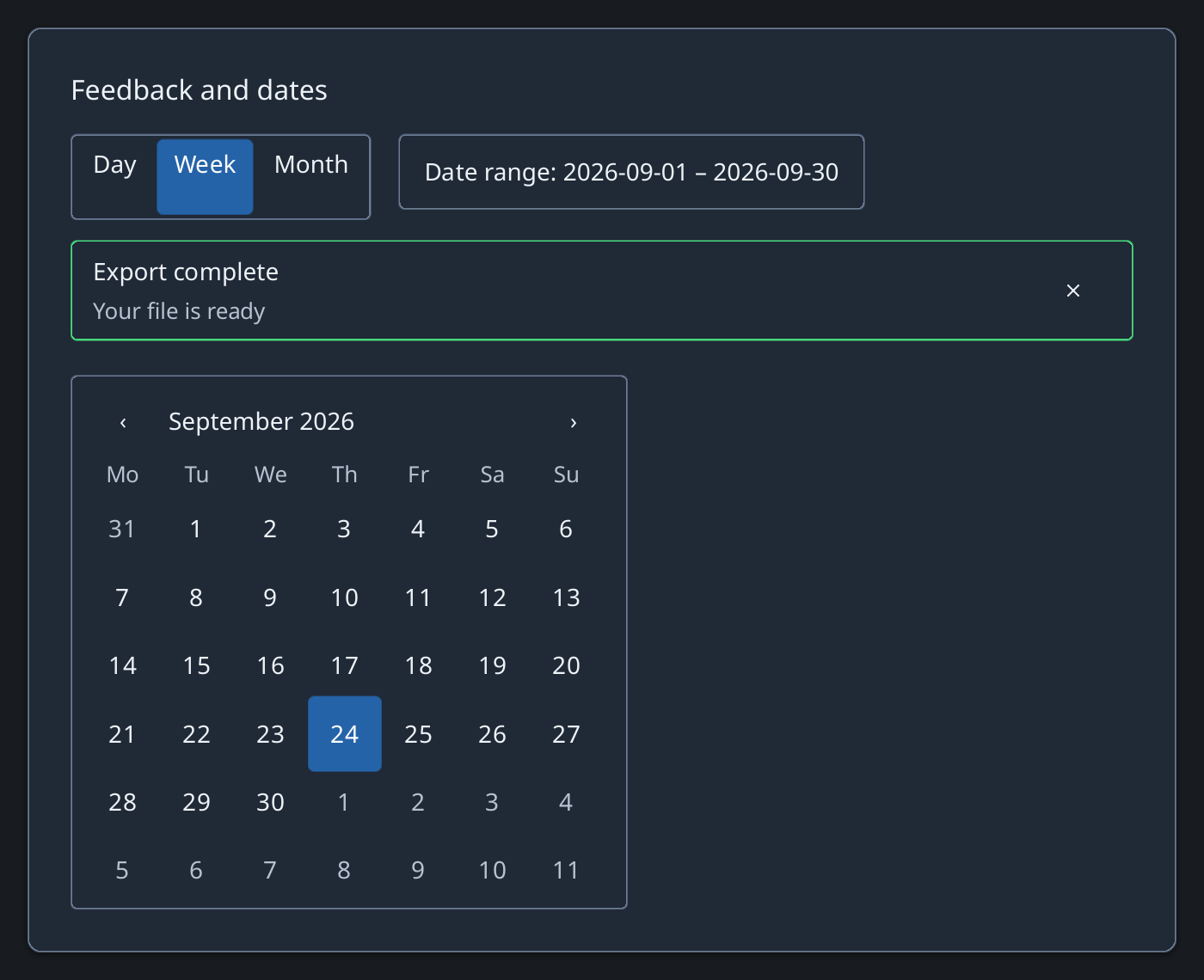
Ruby
Zaniah::UI::Calendar.new(value: "2026-09-25", week_start: 1)
Zaniah::UI::DateRangePicker.new(
  value: ["2026-09-01", "2026-09-30"])
API summary
Constructor options and behaviors are drawn from the component reference.
| Component | Constructor and methods | Variants or behavior |
|---|---|---|
DatePicker | (value, min:, max:, label:, disabled:); on_change | ISO date, day/week keyboard steps |
Calendar | (value:, min:, max:, range:, week_start:, month_names:); on_change | arrow keys move days/weeks, Page keys move months, Enter selects |
DateRangePicker | (value:, min:, max:, week_start:, month_names:); on_change | Calendar-backed start/end selection |
TimePicker | (value, step:, label:, disabled:); on_change | 24-hour time, minute/hour keyboard steps |
ColorPicker | (value, label:, swatches:, disabled:); on_change | hex input and swatches |
Accessibility
Calendar is a grid. Arrow keys move by day or week; Page keys move by month; Enter selects a day.
| Component | Semantic role |
|---|---|
DatePicker | combobox |
Calendar | grid/gridcell |
DateRangePicker | combobox |
TimePicker | combobox |
ColorPicker | combobox |