Browse documentation
Select and combobox
Pick one or several options, with optional text filtering.
Import
Load the optional component layer before using the examples below.
Ruby
require "zaniah/ui"Single selection
Select presents fixed options. Combobox accepts text and filters choices; use matcher: to customize scoring.
Rendered example
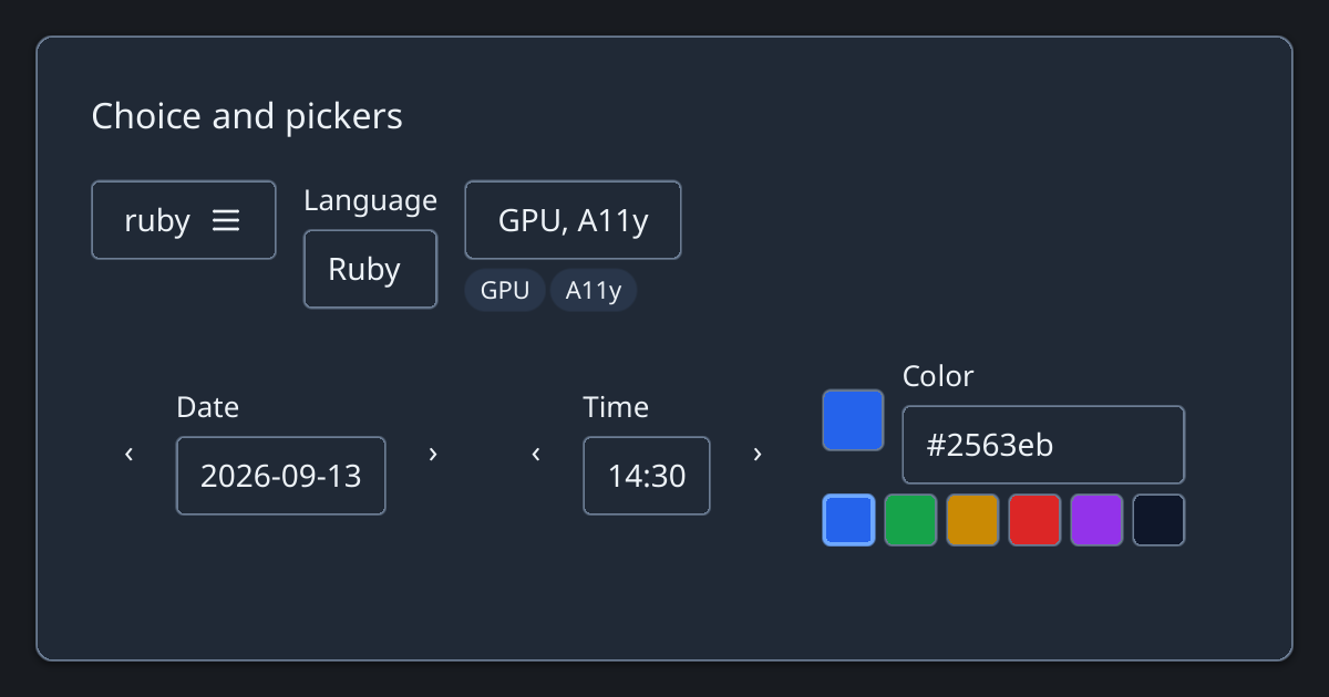
Ruby
Zaniah::UI::Select.new([["Ruby", :ruby], ["Zig", :zig]], value: :ruby)
Zaniah::UI::Combobox.new(%w[Ruby Zig Rust],
  value: "Ruby", label: "Language")
Multiple selection
MultiSelect shows selected values as removable badges.
Ruby
Zaniah::UI::MultiSelect.new(%w[GPU TUI A11y],
  value: %w[GPU A11y], label: "Targets")
API summary
Constructor options and behaviors are drawn from the component reference.
| Component | Constructor and methods | Variants or behavior |
|---|---|---|
Select | (items, label:, value:, disabled:); on_change | single choice |
Combobox | (items, value:, label:, placeholder:, disabled:, matcher:); on_change | editable, filtered choices with highlighted matches |
MultiSelect | (items, value:, label:, disabled:); on_change | multiple selected badges |
Accessibility
Comboboxes announce expanded state and options. MultiSelect exposes its option list as a listbox.
| Component | Semantic role |
|---|---|
Select | combobox |
Combobox | combobox |
MultiSelect | listbox |