Browse documentation
Badges
Add a compact label for status, counts, or categories.
Import
Load the optional component layer before using the examples below.
Ruby
require "zaniah/ui"Variants
Use a short, meaningful word alongside the color. Variants are neutral, accent, success, warning, and danger.
Rendered example
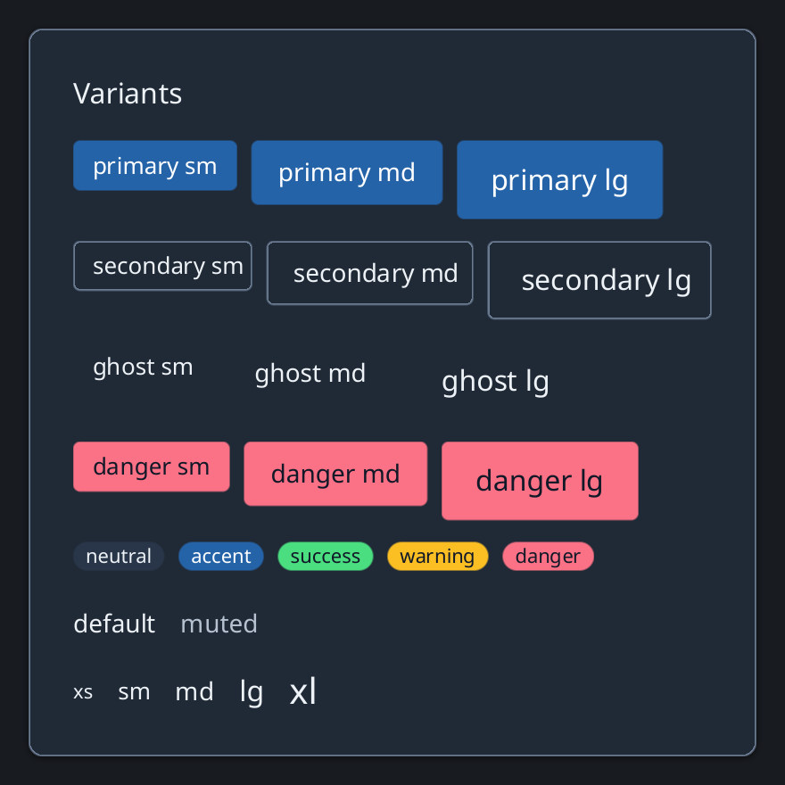
Ruby
Zaniah::UI::Badge.new("Ready", variant: :success)
Zaniah::UI::Badge.new("Needs review", variant: :warning)
API summary
Constructor options and behaviors are drawn from the component reference.
| Component | Constructor and methods | Variants or behavior |
|---|---|---|
Badge | (text, variant:) | neutral/accent/success/warning/danger |
Accessibility
Color is not the only status signal: the badge text must state what the status means.
| Component | Semantic role |
|---|---|
Badge | text |