Browse documentation
Accordion and collapsible
Reveal secondary content while keeping the page easy to scan.
Import
Load the optional component layer before using the examples below.
Ruby
require "zaniah/ui"Accordion
Use multiple: true when more than one section may remain open.
Rendered example
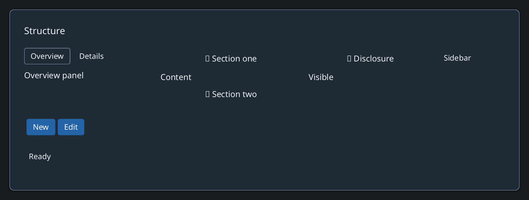
Ruby
Zaniah::UI::Accordion.new([
  ["Details", Zaniah::UI::Label.new("More information")],
  ["History", Zaniah::UI::Label.new("Previous changes")]
], multiple: true)
Standalone disclosure
Use Collapsible for one labeled piece of optional content.
Ruby
Zaniah::UI::Collapsible.new(
  "Advanced options", Zaniah::UI::Label.new("Options"), open: false)
API summary
Constructor options and behaviors are drawn from the component reference.
| Component | Constructor and methods | Variants or behavior |
|---|---|---|
Accordion | (items, multiple:, open:) | single/multiple |
Collapsible | (label, content, open:); on_change | open/closed |
Accessibility
The disclosure button exposes expanded state. Keep its label meaningful in both states.
| Component | Semantic role |
|---|---|
Accordion | group |
Collapsible | button/expanded |