Browse documentation
Checks, radios, and switches
Choose one, many, or an on/off state with controls whose semantics match the task.
Import
Load the optional component layer before using the examples below.
Ruby
require "zaniah/ui"Checkbox and switch
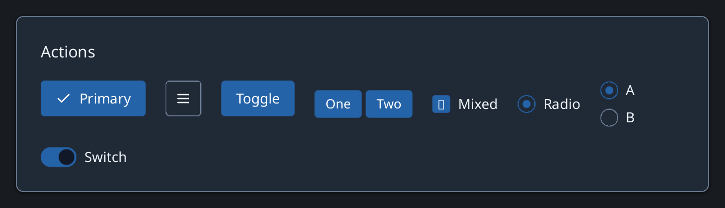
A checkbox supports true, false, and mixed values. A switch represents an immediate on/off setting.
Rendered example
Ruby
Zaniah::UI::Checkbox.new("Include tests", value: :mixed)
  .on_change { |value| puts value }
Zaniah::UI::Switch.new("Notifications", value: true)
Exclusive choices
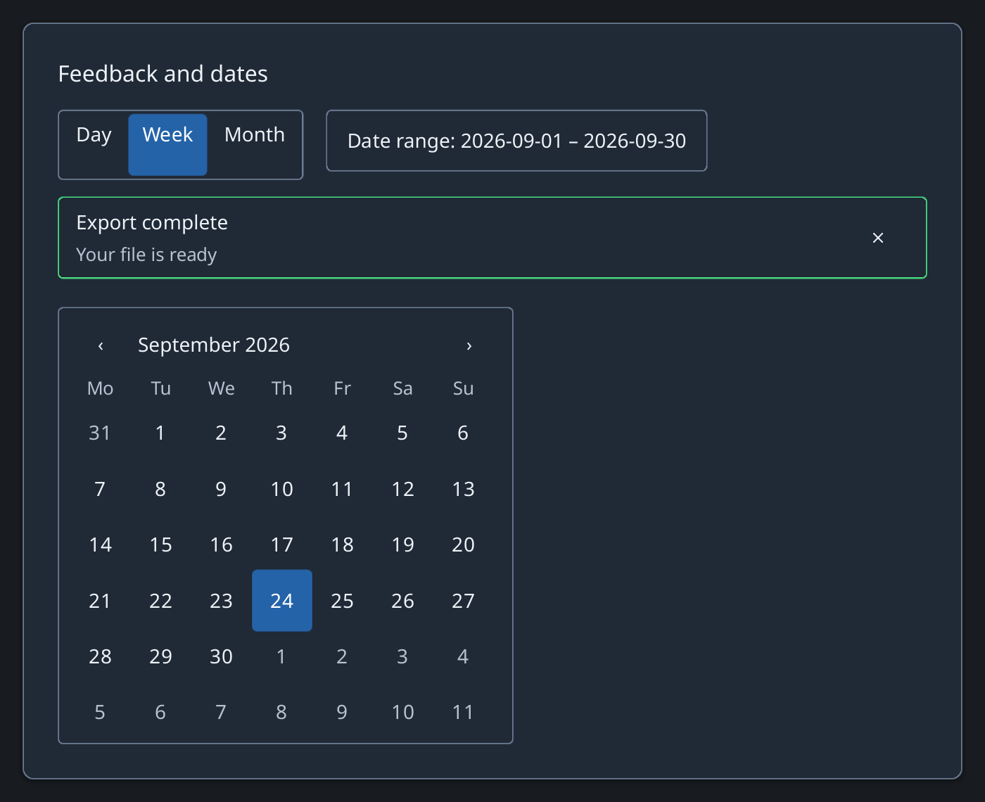
Use a radio group or segmented control for one selected option.
Rendered example
Ruby
choices = [["Day", :day], ["Week", :week], ["Month", :month]]
Zaniah::UI::RadioGroup.new(choices, value: :week)
Zaniah::UI::SegmentedControl.new(choices, value: :week)
API summary
Constructor options and behaviors are drawn from the component reference.
| Component | Constructor and methods | Variants or behavior |
|---|---|---|
Checkbox | (label, value:, disabled:); on_change | true/false/mixed |
Radio | (label, value:, disabled:); on_change | selected/unselected |
RadioGroup | (options, value:); on_change | one selected value |
SegmentedControl | (options, value:); on_change | mutually exclusive segments; arrows/Home/End |
Switch | (label, value:, disabled:); on_change | on/off |
Accessibility
Radio groups and segmented controls expose a radiogroup with one selected radio. Arrow keys, Home, and End move between segments.
| Component | Semantic role |
|---|---|
Checkbox | checkbox |
Radio | radio |
RadioGroup | radiogroup |
SegmentedControl | radiogroup/radio |
Switch | switch |